
Here’s another take on the whole New Wheeled Order thing. Amazing what a casually employed guy with a digital camera and Photoshop Elements can do when he’s supposed to be working for a living.
I don’t have a faux Cyrillic font on the MacBox, so I went with Cracked, which has a nice punkish look to it. Kinda reminds me of “12 Monkeys” for some reason. Oook ook ook.
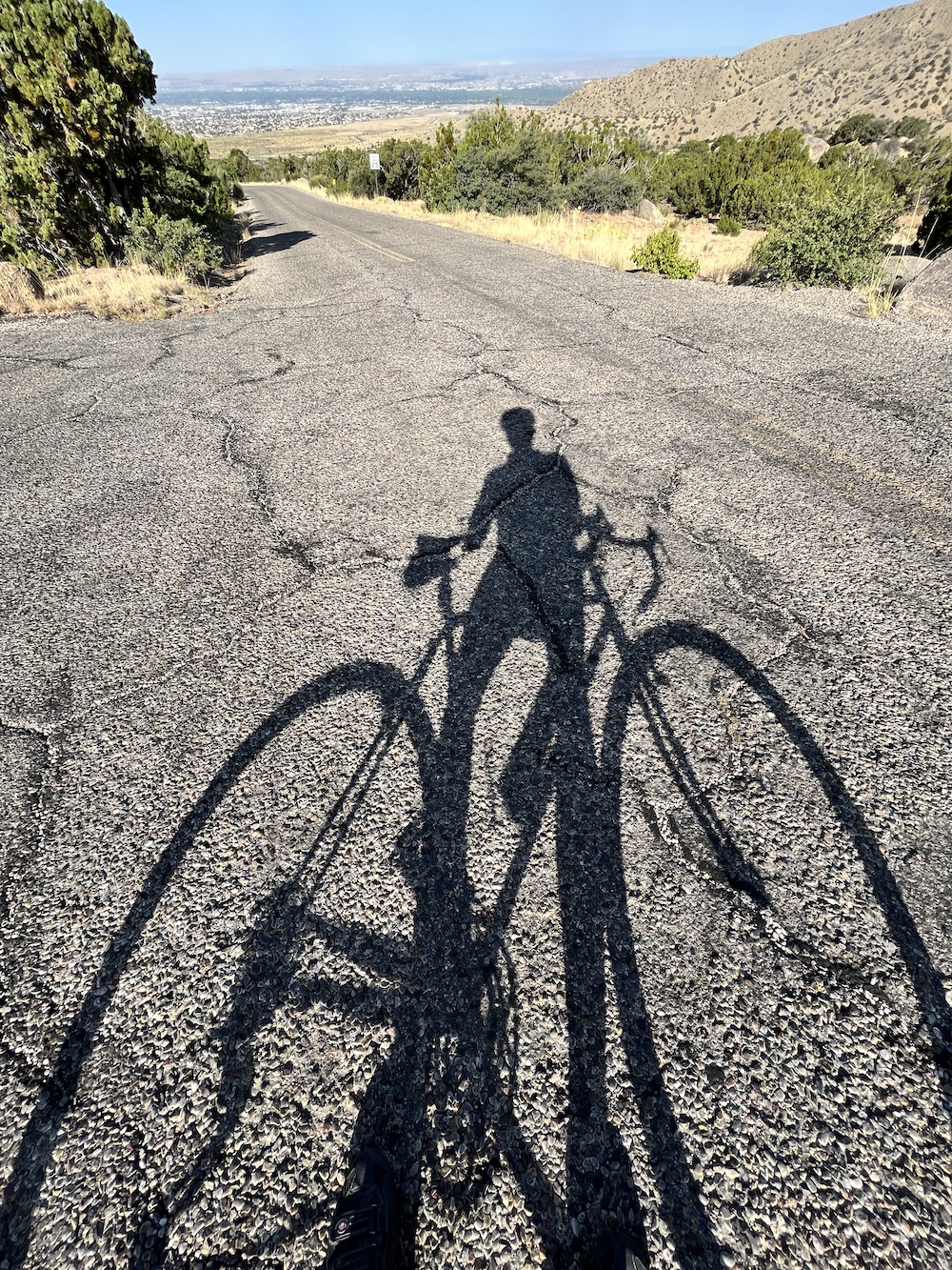
Meanwhile, fuhgeddaboud the mean streets — seems a guy isn’t even safe on the damn’ bike path any more here in Bibleburg. How’d you like to be cycling along and look up from the trail to see an SUV and a station wagon falling out of the sky? That’d get your heart rate up, a’ight.
• Late update: OK, I’ve done a few more mockups and a little light research and I’m thinking I can do T-shirts with the design at right for about $20 apiece (local artisan, old pal). The big design would go on the back, with a smaller badge-size logo over the left hooter up front.
That’s the good news. The bad news is that a small run of jerseys (15-24) will cost us in the $80-per-item range if I go with Voler, which did both versions of the Fat Guy jersey and my own Mad Dog Media kit. Stepping up to 25-49 takes it down to $75 apiece, and 50-99 gets us into the $61-per-jersey range.
I’ll post mockups of both jersey and shirt tomorrow after I’ve fiddled with them a bit more.

Иӑэоҫ ! ҎӐЋЯЇҪЌ Nazdrowia!
I love it. Sign me up for one or more.
As far as that bike path? Sheeeet. I want to start carrying.
We had an out of control car go flying onto a bike path that runs along Paseo del Norte in Albuquerque a few months ago. The motorist hit and killed a cyclist. The motorist, Miranda Pacheco, has been charged with vehicular homicide while driving recklessly.
You know what? When you drive at the ragged edge, sometimes the ragged edge bites you in the ass. Or, more than likely, bites some innocent bystander in the ass. We need to start stringing people up for bad driving.
http://dailyme.com/story/2010080700002228/woman-charged-cyclists-death-man-hit.html
Great design. I’m in for one.
I’m stumped my the mechanics of an SUV rear ended by a station wagon, rolls once and still ends up on top of the station wagon. Realize both vehicles went of the the embankment, but gee you guys live in some really odd alternate physics universe out there.
Same strange logic and/or physics as in CA where a bunch of yahoos stand inches away from speeding off-road vehicles in a RACE, then act all surprised when one of ’em rolls over and kills a few. I’ve wondered about this before while watching World Rally Championship events on the tube where these boneheads stand right in harm’s way while vehicles slide past on the edge of control — and of course my wife’s standard answer explains it all — “people are stupid”
On the other subject –I’ll take a t-shirt and a jersey when/if you get ’em made.
HI Patrick
I will put my dibs in for a Jersey (XXL club cut) and t-shirt (also xxl).
WHile you are talking with Voler, can you get mote of the original Fat Guy jerseys – the big yellow ones. I need at least 2 new ones and the Velo people don’t have them anymore.
John Loesch
PO’G- this logo looks better than the previous one, except that it sort of looks like some odd mathematical symbol. I guess my issue with it is that it is imitating a visual that we have seem millions of times before but doesn’t add anything to it. It is almost too pedestrian in the presentation. A bit too serious to be taken lightly. The subtlety of the message is lost in the image and the text. Cyclists would get it (maybe) but the general population would just say “meh?” and move on. That is the beauty of the Old Guy jersey. Old or fat, old and fat, people “get it.”
I am thinking if you use the “New Wheeled Order” tag why not show a shitload of cyclists in a parade…and then if you want to add something like Churchill’s quote add in a chain and pump. Obviously the parade would be idealized with a drawing – maybe cyclists in sillouette – and they could be raising their arms with pumps, tools, etc. above their heads. Just a thought.
I seriously doubt I’d plunk the dough down for this design. It just doesn’t idealize the thoughts for me. Sorry.
Looks great. Let us know when we can buy some shirts/jerseys please. Big ones haha.
I WANT ONE,let me know
Patrick,
From 35 years of figuring out how to make the profit motive work to result in coin in the wallet, I recommend the following. It sounds like you aren’t entirely sure you’ve got the design dialed in yet, and you may not before you push the “order” button. Try making just the t-shirts first, and get feedback. Given the painful honesty of your fans, you’ll get good feedback to really dial in the jersey design before ordering from Voler (great guys by the way).
And you really want it dialed in. Us old guy readers each buying one or two won’t get you much jingle. But large distribution retailers (like Velogear, Trek Specialized, QBP etc,), now that’s different. If they like it, your cashola payoff goes up and that minimums issue goes away.
And get busy. My OGWGFIW team jersey has developed stretch marks to match the ones on my gut and I need a new one. Size Large please.
Have a “Old guys who get fat in winter” Jersey and its my favorite non-wool one. POWER RINGS! Almost always gets a chuckle especially from wives who ask me where I got it so they can get one for their husbands. I got mine from my best friend who is older than I am so that was ok and funny and true but if my wife had given it to me….hmmm. Anyway I am looking forward to the proposed T shirt. As for Sponsors…..
Hammer and Cycle
bourgeoisie gel padded saddles
Capitalist Cranks
Proletariat Pedals
Trotsky tubulars
Workers Paradise Wheels